Vogue: From Magazine To Mobile
With technology continuing to develop, it is inherent that design develops conjunctively. As a growing designer, I have found a passion for user experience and the importance of interface design. Linking my new found passion with research, I have decided to pursue a project in researching the transition of content from magazine to mobile. Being the pop culture, fashion-loving, magazine junky that I am, I am constantly reading articles on several websites including Vogue, Cosmopolitan, Harper’s Bazaar, Elle, etc. and have noticed that all of these publications do not have a mobile application that mirrors their desktop site with content readily available. To understand the current transition from magazine to mobile, I have chosen to focus my research on the mobile application of Condé Nast’s publication, Vogue.
This past week, I began researching the best practices for user experience and interface design as well as transition states of mobile applications. From my surface research, I was able to identify key practices for a successful digital magazine:
Optimization is everything. Optimization is one of the primary reasons I have started researching the transition from magazine to mobile. When thinking about mobile optimization, I have found that there are three main principles you should take into consideration when designing: typography, layout, and color. Mobile typography can make or break a user's experience, using a typeface that is less visually complex allows for better readability. The most visually changing aspect from a magazine to mobile will be the layout. Articles are often formatted to fit across a spread (facing pages), it is important to make sure that when it is reformatted that the content is positioned to still read normally. The last main principle to be aware of when designing for mobile is color. In print design, CMYK colors are used compared to RGB which is used for digital. If the color mode is not changed from CMYK to RGB, the colors presented will be much duller than anticipated.
Digital allows more room for interactivity. Unlike print, when something is published digitally it is not set in stone. This leaves more room for trying out new tactics and access to additional digital content such as embedding videos, gifs, and audio. The ability to add interactive content can transform a digital magazine making the user more engaged. The endless possibilities generated with the interactivity of digital design allows magazines to now approach content like never before. UX Designer Paulina Kubala-Chuchnowska suggests the adoption of moving images for cover art as the cover should be designed in such a way to catch people's eye regardless of the screen size.
A good user experience is fostered by accessibility. While using any app there is nothing more frustrating than not being able to easily navigate through content. When it comes to digital magazines it is important to have access to all articles in the edition and be able to access it quickly. Iconography and language should remain consistent with the desktop website to make the transition smoother for current users.
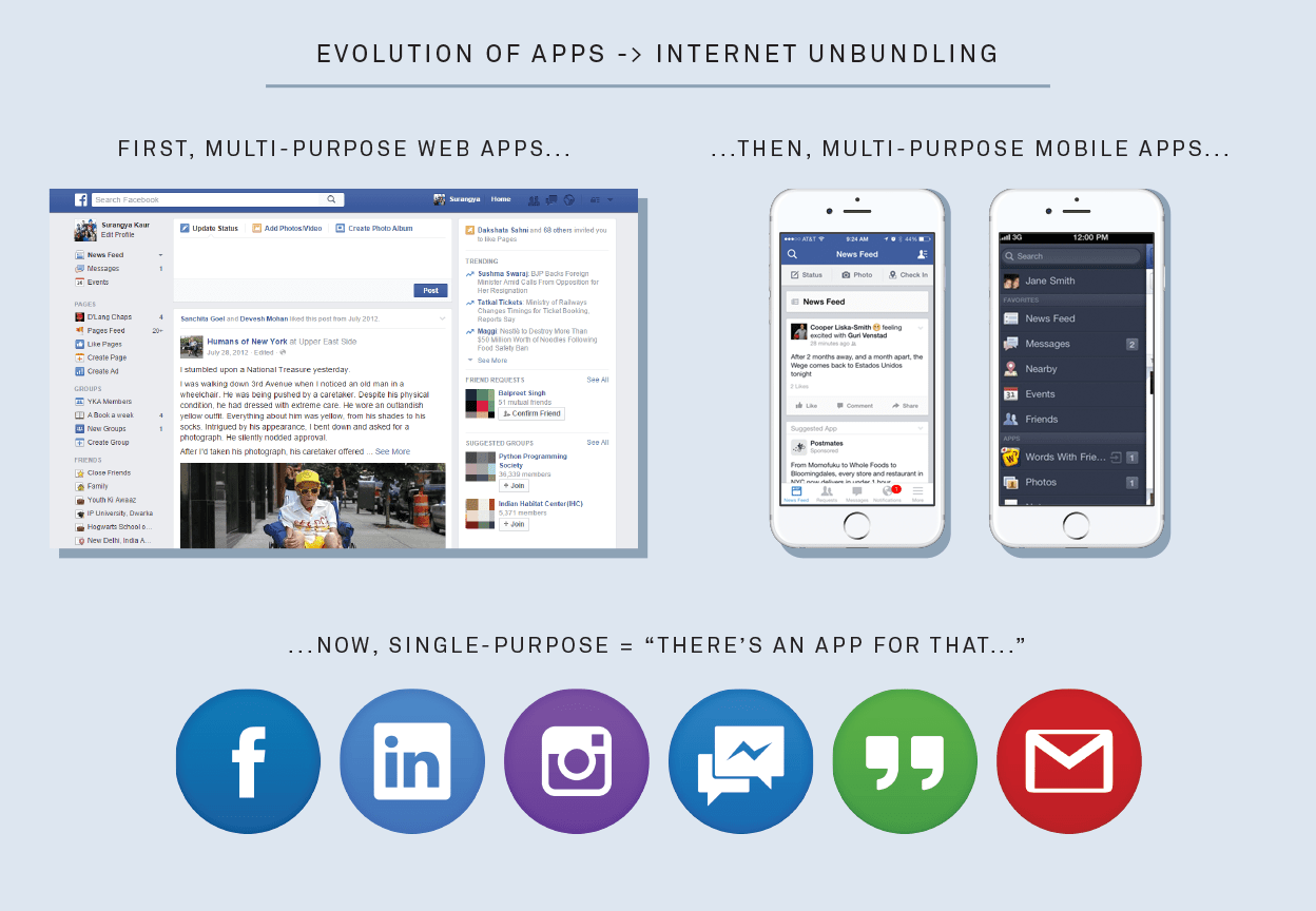
When researching interface design, I was also able to identify that Vogue has taken an unbundling approach to mobile, meaning they have multiple single-purpose apps. An unbundled approach to mobile may work for some companies like Google as they have separate apps for Google Drive, Gmail, Docs, Sheets, etc. however for a publication company, I believe this makes it harder to access the content.
Source: KPCB Internet Trends
In a world where print is considered to be dead, publication companies must adopt digital and mobile practices. Since Vogue’s first mobile launch in 2016, they now have three mobile applications for download: Vogue Runway, Vogue Magazine, and VogueWorld. The app Vogue Runway is an all-access pass to live streams and runway shows around the world and allows you to view millions of photos dating back to as early as 2000. The two remaining apps Vogue Magazine and VogueWorld are a breakdown of the content displayed on the desktop website. The Vogue Magazine app is exclusively dedicated to downloading this month’s issue of Vogue for digital access as VogueWorld is dedicated to the free content and latest stories published on the website. As a Vogue subscriber, I am often frustrated that I need to switch back and forth between VogueWorld and Vogue Magazine for all of the unlimited access to content that I am offered. The current state of the Vogue Magazine app is like having a car without a radio, it is missing all of the additional free daily articles that are being published on their website and VogueWorld.
Based on this frustration I have put together a twofold proposal to redesign Vogue Magazine and bundle the content with VogueWorld. The proposal outlines the main problems at hand with the current version of the applications and why it would benefit from a redesign from a designer’s perspective to create a better user experience. The foundation of the project will center on Vogue’s reputation in the fashion industry and upholding its high standard to all mediums.
To view my redesign proposal, click here.


