Vogue: An Approach to Project Management
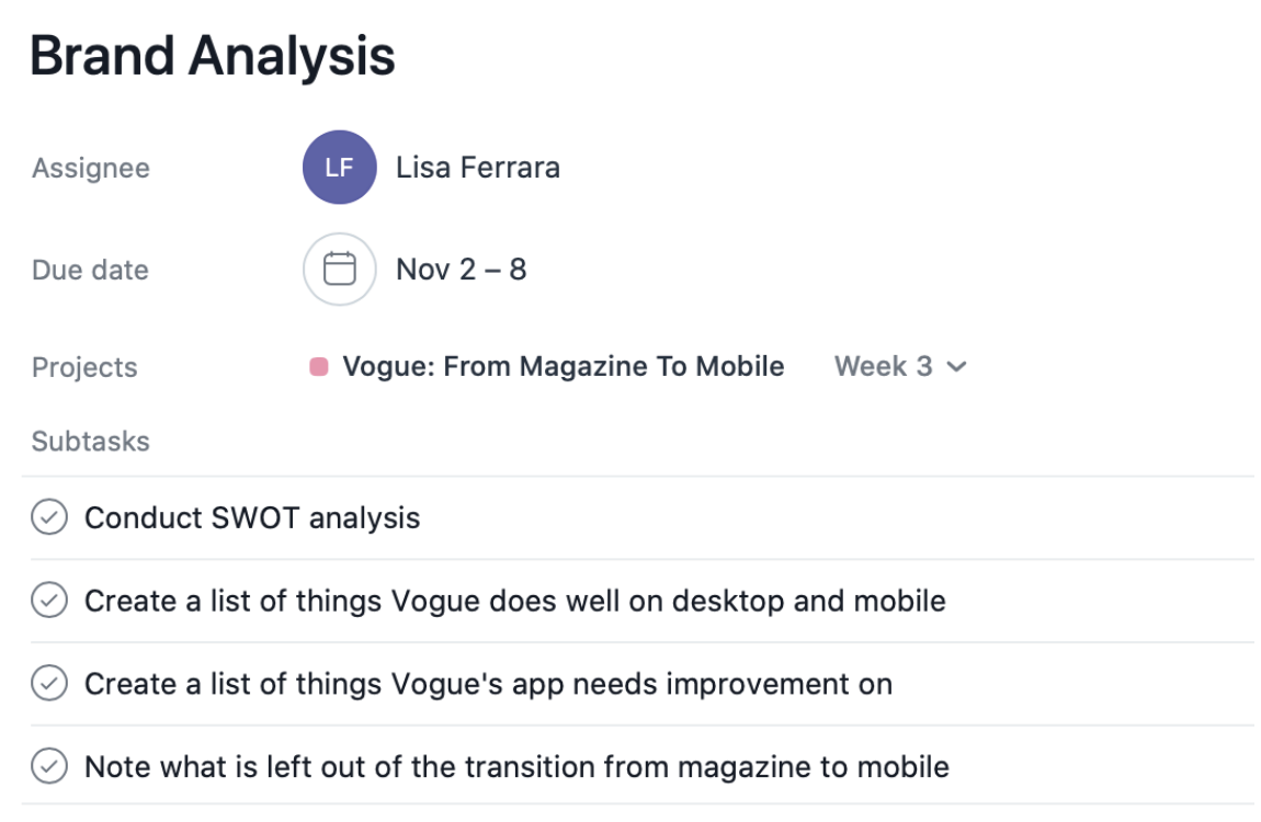
With previous experience of redesigning and creating a mobile application before, I looked at my past projects and tried to identify where I can improve in this process. The biggest improvement I aim to make during this redesign process is finding ways to better utilize my time. For my proposed application redesign, I decided to use a project management system (PMS) to fully visualize how my weeks will be laid out going forward. To organize and manage my project workload, I outlined my weekly deliverables in the PMS, Asana. Asana has allowed me to visualize my development process ahead of time and break down my weekly deliverables into actionable items. Action items can be defined as tasks on your list that you need to complete that are clearly defined with subtasks. For example, in the picture below you can see my week 3 task for Vogue’s brand analysis. This task has four subtasks otherwise known as action items outlined to encompass everything needed to complete that task. The benefit of using action items is it allows you to get a better idea of how long each task will take to complete and how to use your time wisely.
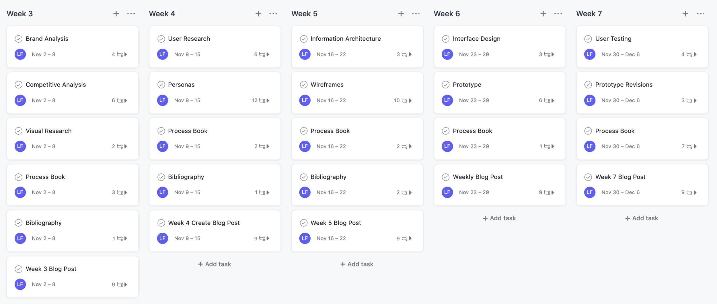
After trialing a couple of different PMS like Trello and Monday, I have settled on Asana because of its simplicity. I like how visually focused Asana can be and how it can be utilized amongst team projects if needed. My favorite part of using a PMS is that everything is now in one place and not cluttered on my desktop with sticky notes. Using Asana has allowed me to visually see what I should be completing each week to attain a high fidelity fully functioning prototype in seven weeks. When outlining this project, I took into consideration my outside responsibilities and made room for procrastination and creative ruts. I have split my project strategy into two phases, phase I: research and phase II: production. Phase I will span across weeks three and four as I will be focusing on creating a brand analysis and a competitive analysis to fully understand how to approach the redesign in the later weeks. Up until this point, I have been focusing my research on the best UX practices and what the current state of magazines in mobile is. Weeks five through seven will start phase II: production and be very design heavy. Through these weeks I will be focusing on building the foundation of the app and later a high fidelity prototype. As my main goal of this project is to utilize my time better, I will be using my action item subtasks to get a jist of everything that I need to do to check it off my list. The majority of my tasks were created to have a deadline for the Sunday of that week so that I can start fresh each week with a new topic. I do have some tasks that I will be adding to weekly such as my bibliography, process book, and blog. I have set up my bibliography to start being annotated during the first few weeks so that I am not cramming at the last minute to complete them all. As my research will be ongoing, during week seven I will be annotating any other sources that are left.
The image above is an overview of what my next few weeks will be looking like. When I was creating this outline I began by writing the tasks that I knew I had to complete such as developing personas, information architecture, wireframes, etc. Outlining my initial tasks were easy as I was pulling them from my redesign proposal that I created last week. To make sure I was not missing any key tasks, I browsed through Asana’s template gallery for web and mobile design. This feature of Asana was extremely beneficial as I was able to recognize that the steps I originally planned were also included in their templates.
To view my full project management plan, click here.
So what’s next? Based on my management plan, next week I will begin conducting a brand analysis of Vogue to understand where their strengths and weaknesses lie. I will also be conducting a competitive analysis among brands in the same magazine to mobile space. I will be looking at apps that have a similar mission to Vogue's such as Elle, Harper’s Bazaar, and Seventeen but also non-fashion related publications such as The New York Times, Apple News, The Wall Street Journal, etc. My focus here will be looking at how these companies translate their heavy content into a mobile application. As I took a glance at these sites before I settled on Vogue, I noticed that many sites are not mirrored amongst their websites. I will be taking detailed notes next week to make sure that I understand the current state of Vogue’s application and what is left out of the transition.


