

Vogue: The Final Product
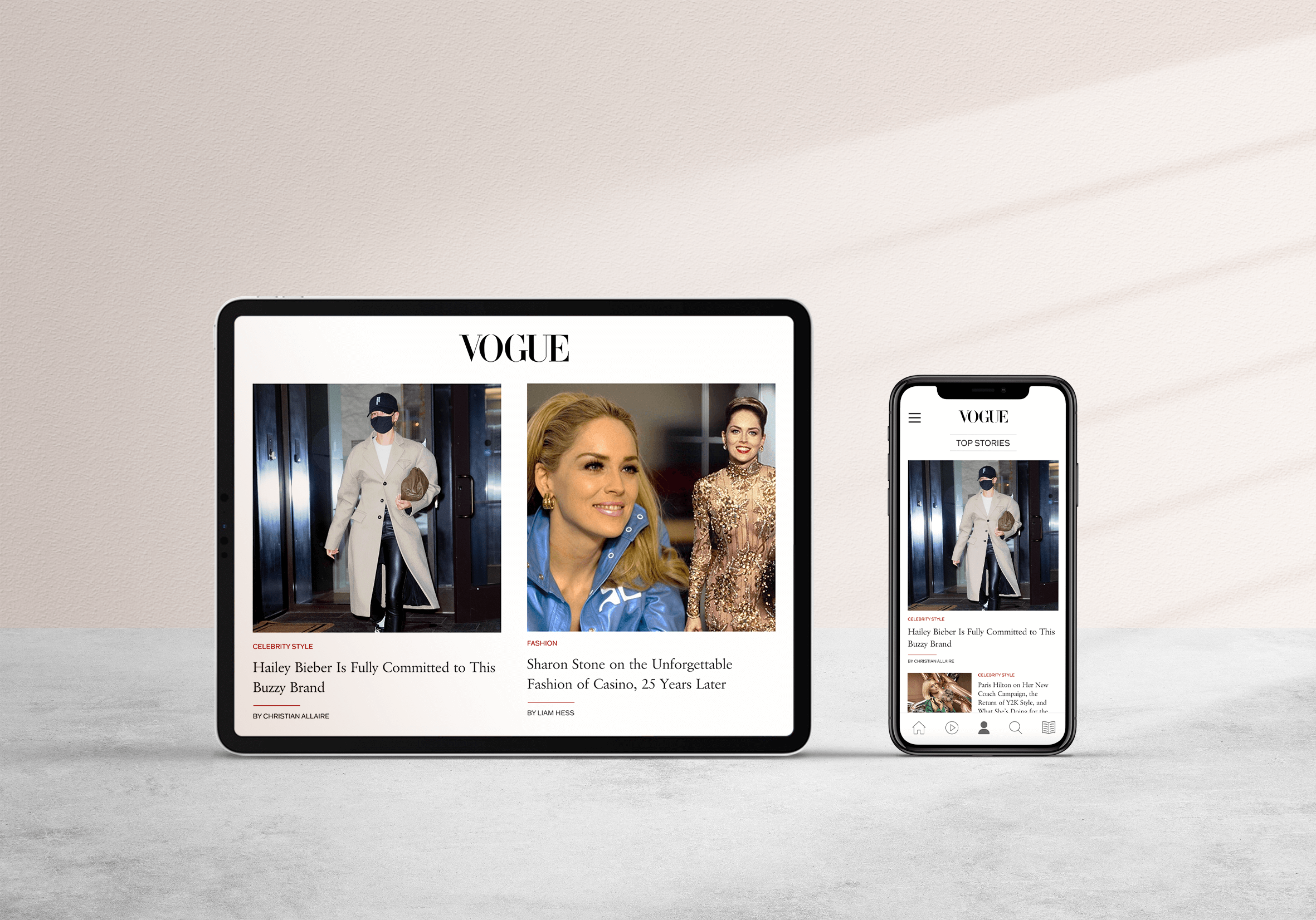
Over the past seven weeks, I have spent my time redesigning Vogue’s mobile application. Guided by the proposal I had presented in week one, my redesigned application focuses on the bundling of Vogue Magazine and VogueWorld while addressing the need for visual & content consistency among the two apps to create an interface that is easily digestible. The prototype I have created is a solution for a user-centered design while still drawing upon Vogue's reputation in the fashion industry and upholding its high standard to all mediums. The core features of the application include discovering the latest fashion trends, staying up-to-date with today's top stories, getting alerts on topics you choose, and sharing content to your social media feed while also having access to their monthly issues and archive.
After reviewing my mockups, I decided to go with a combination of all three designs to benefit the features that were glorified during user testing. The navigation of the prototype follows the design of mockup one with bottom navigation and hamburger menu. The bottom navigation has five tabs instead of four and includes components to go to the homepage, video page, my page, search page, and magazine page. The top navigation offers category tabs to view as well as settings and social media pages. As Vogue is most notable for its presence on social media, the inclusion of social media was imperative to the application. The navigation is consistent and accessible on every page. There are additional navigation features on category pages that allow you to filter through different sections that are offered. For example, in the images below you are able to see the different categories that are accessible under the fashion tab. This navigation has a parallax swipe feature allowing the user to dictate what content they would like to have access to.

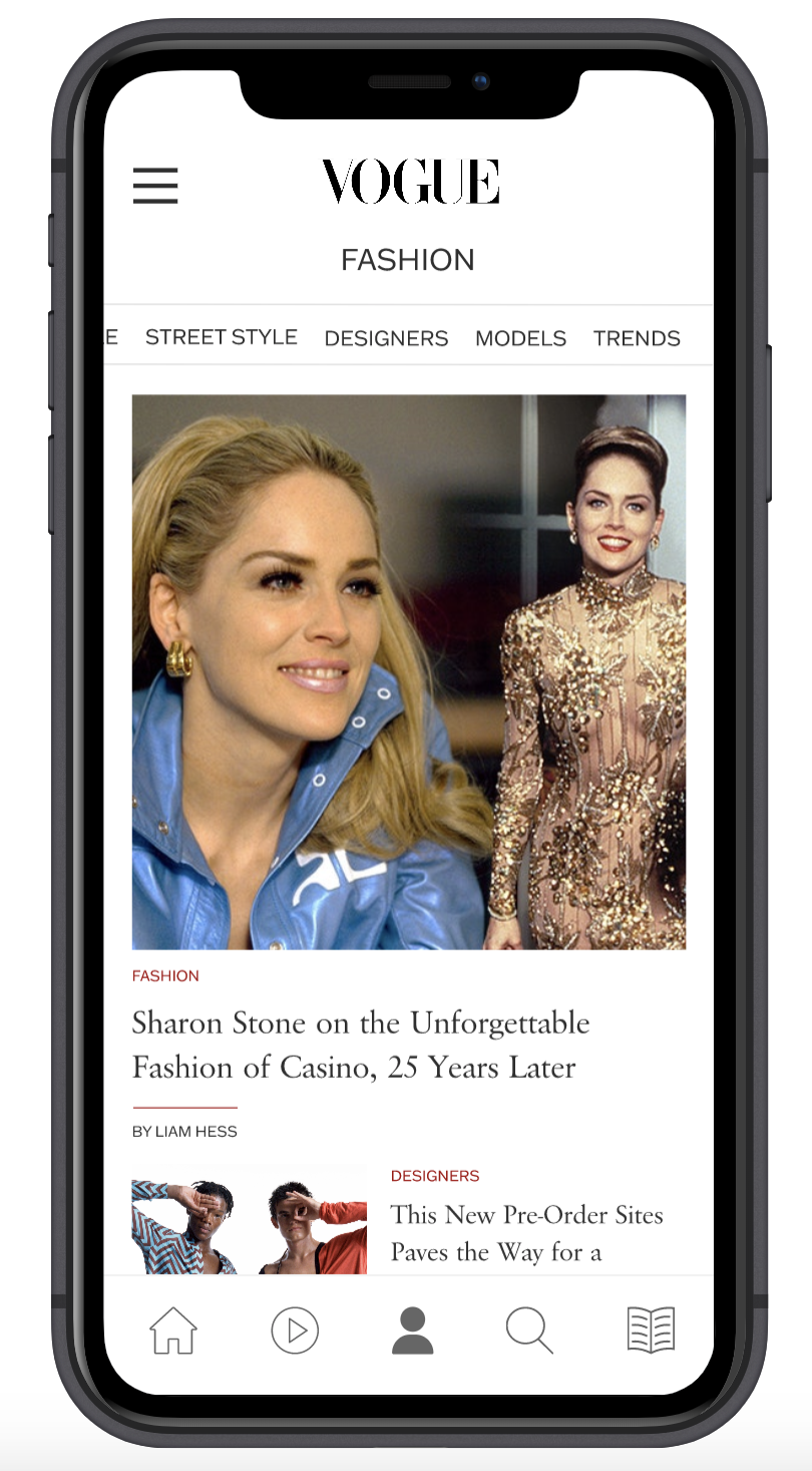
In this prototype, you are able to access the top three articles on each category page to get a feel for how the articles will open and close when you click on them. Each article featured in this prototype is accompanied by an image with a width of 375px to get the maximum quality of the image without it taking up the entire screen. The navigation features an article page that includes the same bottom navigation bar in addition to a back arrow and share button. In each article, there is also an option to save the page which can be accessed by using my page navigation component. At the end of each article, you also have the option to view more articles featured on the app. This prototype uses the same three articles in the read more section however, in the established design they should be tailored to the topic the article being read is on.
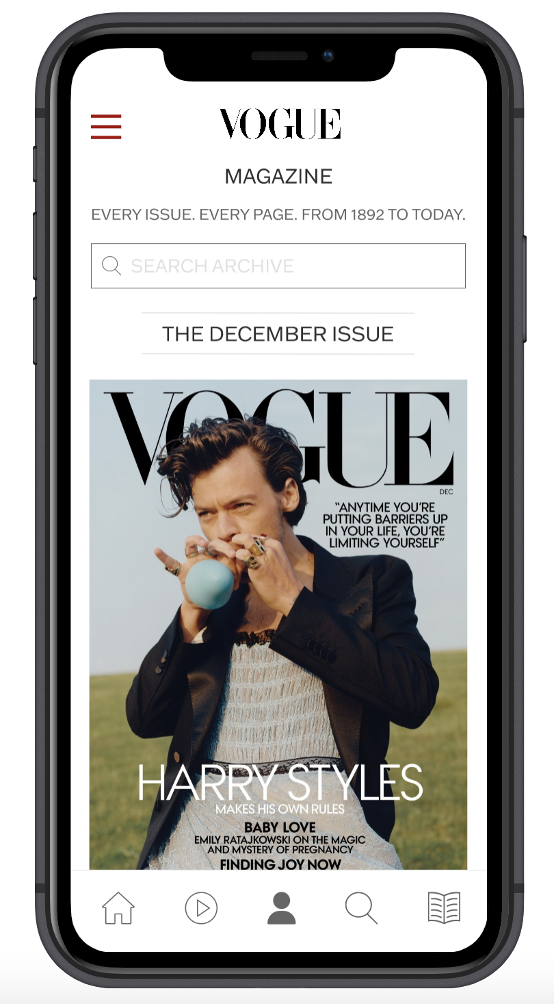
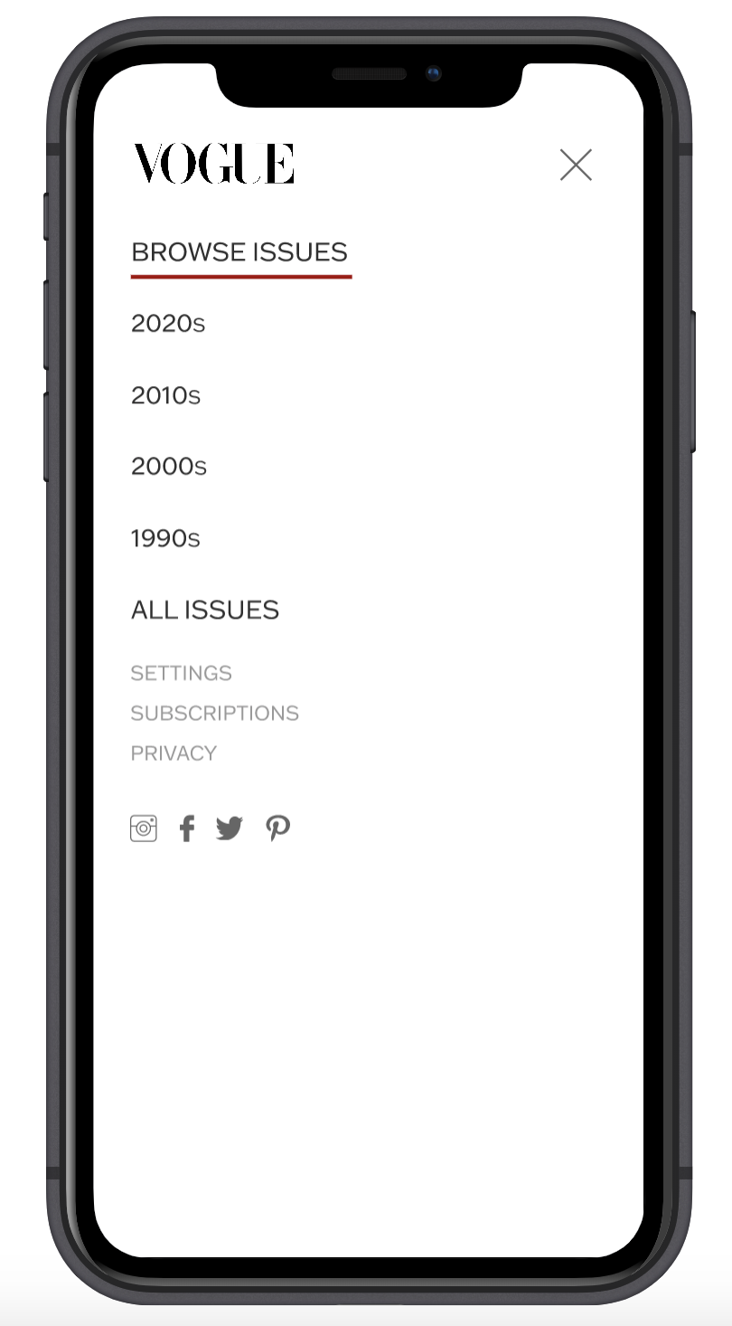
The magazine page is something that I struggled designing the most as there was so much content and not enough content at the same time. The magazine page is based on the Vintage Vogue that offers every issue and every page from 1892 until today. This page was something that I knew I wanted to incorporate into the app from the beginning as it is breathtaking on the website to see how magazine design has transformed throughout its existence. At the forefront of the design, you have the ability to search the archive in case you are looking for a specific issue or are just curious what their magazines looked like in a specific month and year. Below the search bar, you are able to view the magazine’s latest issue is as well as the year 2020 in Review. The section 2020 in Review allows you to view all of this year's issues in chronological order at the tap of a finger. As it gives you access to every issue since its debut in 1892 the farther you scroll down the more you go deeper into older issues. The hamburger navigation on the magazine page is red to signify a difference. The red hamburger menu is dedicated to browsing the magazine archive and is sectioned off by decades. When you click on a decade from this menu you are then able to view the years within’s magazine issues.
If you were to view a magazine issue such as the 2020 December issue outlined in this prototype you would be immediately brought to the cover of the issue. The cover has been optimized to fit the screen without losing its quality and ability to navigate through the rest of the issue. Using the arrows at the bottom of the screen for navigation, you are able to flip through each page of the issue. The hamburger menu at the top of the screen allows you to navigate through the issue’s table of contents and directly bring you to the article or advertisement. Opposite of the hamburger menu is an “x” to be able to close out the preview whenever you decide.
To view my fully functioning prototype, click here.
To view my project page, click here.