

Vogue: From Black and White to Color
This week I began putting all of the pieces together to create mockups for each of my wireframes. For my mockups, I used the same articles and images so that when I went to user testing a user did not point out something arbitrary like they liked this article better. Adding color to each wireframe was easier than expected as Vogue already has a previously established style guide.
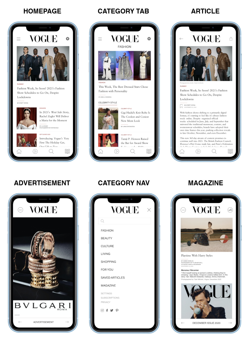
Wireframe 1
Mockup
This mockup focuses on highlighting a featured article and displaying their latest articles below them. The feature article is something that Vogue could use to either promote articles or pin an article that an extensive amount of users seem to be viewing. The navigation for this mockup consists of a top hamburger menu and a bottom navigation bar. I decided to include two types of navigation features so that users could access the category tab which is in the hamburger menu at any point in time. Users have the option to search through the app in both navigation features to allow the user to never feel frustrated. The article tab here is similarly laid out to how Vogueworld lays out their content with their image at the top and content to follow underneath it.
Adding color, images, and text to the magazine feature, made the mockup come to life. The magazine section is what sparked my interest in this redesign so it was important that I was able to address all of the struggles users currently have. One of the main struggles I wanted to address was allowing content to be fully optimized and not be cut off on the screen. The magazine article is mocked up like a typical online article instead of being placed in the format of a pdf. If I tried to organize the content by utilizing the pdf version, the text and images would be out of place and stretched which would ultimately be not readable for users. The magazine article also gives the user an example of all the digital features that can come with reading the magazine digitally versus in print. For example, Vogue can now use their recordings of authors reading their content to give users the option to read or listen to the article.
User Testing
To test out my mockup, I asked my roommate to scroll through the application to see how she feels about its features. At first, she seemed confused about how to navigate through the app but she did not know that this was her first draft and she wasn’t able to just click everywhere. After I briefed her that this is a mockup for a later highly functional and developed prototype she felt more comfortable scrolling through the mockup. She reassured me that the type size, colors, and iconography complemented the articles and their content rather than clashed. She pointed out that she was not a fan of the double use of the search bar in both navigations as she was not sure which to use.
To view this mockup, click here.
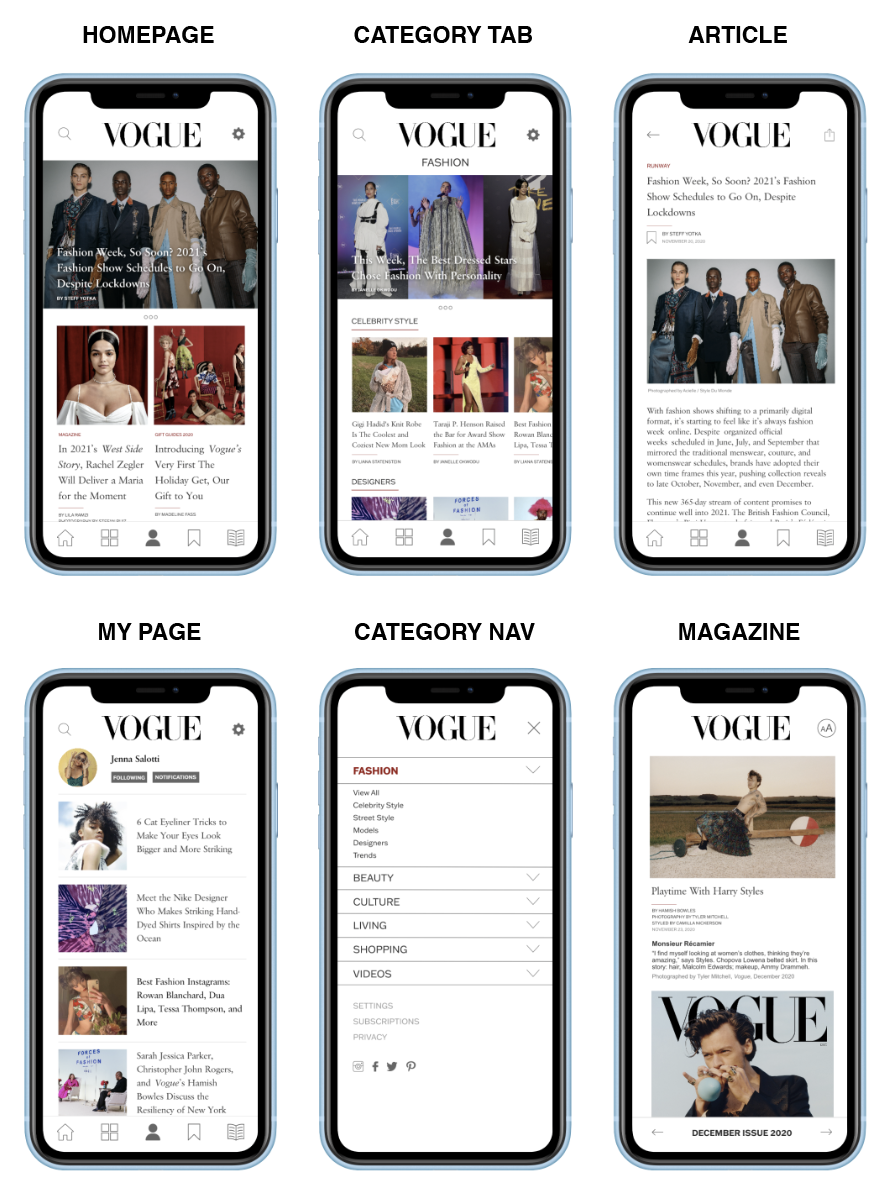
Wireframe 2
Mockup
This mockup focuses on highlighting a featured article and displaying their latest articles below them just as they are laid out on Vogueworld. The featured articles indicate a hero slideshow so Vogue can highlight more than one article. The featured articles have a text overlay applied to them so that the images could be larger and showcase their high quality. The navigation for this mockup highlights the main navigation points (home, category tabs, my page, saved articles, and magazine) without having second navigation on the page. In this mockup, the category tab is within the navigation to be accessed at all times. The category tab was designed to be able to visualize both the main and subsection of each category before you go to the actual categorical page unlike in wireframe one. The article tab is designed similar to how the Vogue website is designed with the article title above the image and text. The magazine page is mocked up similarly to the first wireframe except for the table of contents has been moved to the bottom navigation labeled as “December Issue 2020.” Overall I tried to utilize Vogue’s exceptional digital features that they highlight on their website.
User Testings
My roommate had tested out the second mockup as well but from the start, I could tell that she was not as fond of this design compared to the first. She explained to me that she believes having both “my page” and “saved” articles are redundant in the bottom navigation and they would be better suited combined in a section. It was clear that she was not a fan of the text overlay on the featured images. This made it apparent to me that it should be scratched immediately.
To view this mockup, click here.
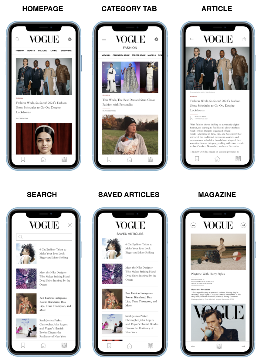
Wireframe 3
Mockup
The way this mockup has been developed to mirror the way Vogueworld already conducts its layout. The layout of articles is similar to Instagram’s home feed as it showcases large high-quality images in its endless scroll feature. Compared to the other mockups the bottom navigation tab is minimal including two of the features that are included in the Vogueworld app. A top categorical tab is a new approach that UX designers are taking to mobile that allows you to filter through the sections on each page. Originally, I was not a fan of this approach however, I have warmed up to it. For the article tab, the images go edge to edge to encapture the quality of the picture.
User Testings
Based on her facial expressions and the comments she had made during her walkthrough, this mockup has been my roommate's favorite. Her favorite feature was the category filter tab as she was able to scroll through the different subsections on the page. The only comment she had made was to include more detailed bottom navigation such as the one I had in mockup 1. She explained to me that this app was easy to navigate as it has a similar look to Instagram. She was pleased by the font size and leading as it was not tight and did not make her feel overwhelmed. The last comment she made was that each mockup has strong features however she wished the best parts of each were combined into one design.
To view this mockup, click here.