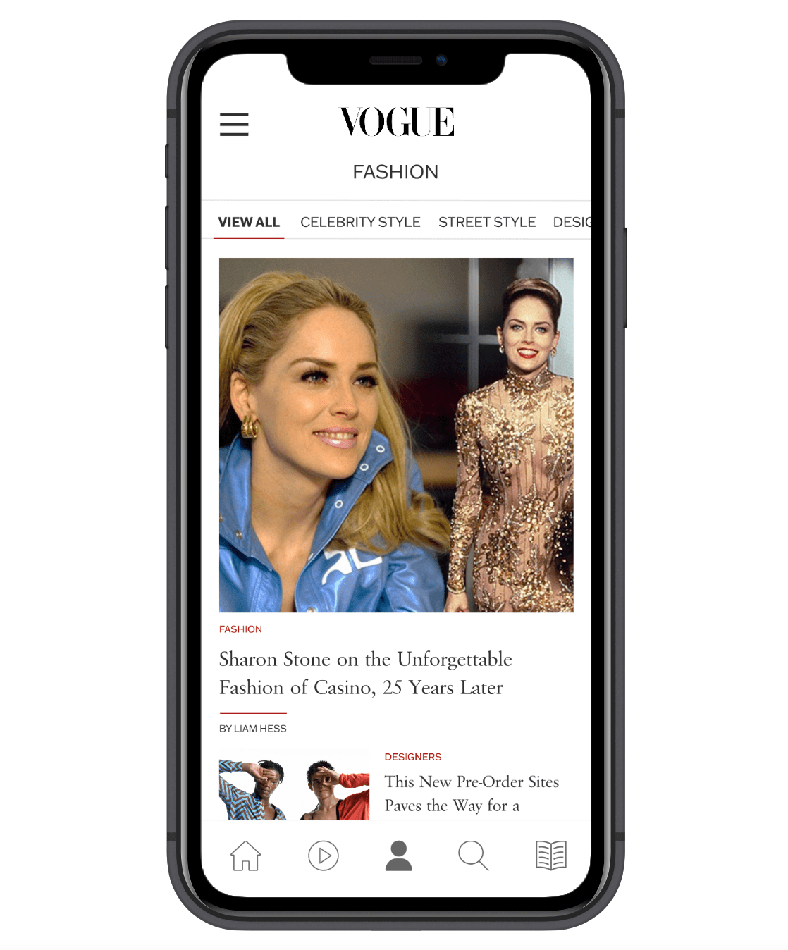
Vogue Mobile Application Redesign
About
For decades, Vogue has been the leading fashion and lifestyle magazine amongst women. The magazine made a name for itself with its focus on high-quality photography and editorial content. Vogue holds incomparable power within the industry as it has defined the culture of fashion since its debut in 1892. In 2016, Vogue went digital and created three applications available for download: Vogue Runway, Vogue Magazine, and VogueWorld. The app Vogue Runway is an all-access pass to live streams and runway shows around the world and allows you to view millions of photos dating back to as early as 2000. The two remaining apps Vogue Magazine and VogueWorld are a breakdown of the content displayed on the desktop website. The Vogue Magazine app is exclusively dedicated to downloading this month’s issue of Vogue for digital access as VogueWorld is dedicated to the free content and latest stories published on the website.
* This project has no direct affiliation with Vogue
Problem
Vogue has taken the unbundled approach to mobile where content is dispersed through separate applications. Each application has its own purpose and is targeted towards both subscribed and not subscribed users. One of the benefits that Vogue outlines for its subscribers is having unlimited access to all content published. However, this is often hard to access when it is spread across three separate applications. The purpose of downloading a mobile application is to ease access to content, separating content for a Vogue subscriber does not promote ease. As the layout and content of Vogue Magazine and VogueWorld do not mirror the website, there is a need for visual and content consistency among the apps as well as an interface that is easily digestible.
Solution
The solution for a smoother and cohesive transition from magazine to mobile is two-fold:
To redesign and optimize the content on the Vogue Magazine app for mobile viewing
To bundle the application with VogueWorld to allow subscribed users to have access to the unlimited content they are promised
The main objective of this mobile redesign and bundle was to design through user empathy and create an engaging and seamless experience for the transition from magazine to mobile.
The Design Process
Phase I: Research
Brand and Competitive Analysis
Phase I began with a brand analysis of Vogue to gain insights on what practices set their magazine apart from others. The analysis hit on what they currently include on their desktop site and mobile applications as well as a list of what is left out in the current transition. Afterward, I compiled a competitive analysis and visual research. The apps chosen for the analysis were a mixture of similar fashion magazines to Vogue and general publications to provide insight into what works well for this type of transition and what doesn’t. To understand the visual transition, desktop sites were also looked at in conjunction with their app.
User Research
User research began by looking and annotating the reviews left on the apps chosen for my competitive analysis. From there in conjunction, with the key takeaways, I have found from my competitive analysis, I developed questions to ask my participants in a usability interview. Based on the user interviews conducted, I created an empathy map for each participant. The empathy maps created touched upon what each user was thinking, feeling, needing, and doing when scrolling through Vogue’s applications and desktop site. Each empathy map also gave insight into existing problems and possible solutions.
Personas
After analyzing the user research data collected, five personas were developed to better understand the potential users' motives. Since Vogue already has their target market and demographic established with data to back it, the personas were created to be inherently detailed to highlight their key traits and overall needs when using the application. Each persona includes a short biography, their behaviors and goals, personality traits, technology abilities, and what subscription services they are currently subscribed to. When I developed these personas I wanted each of their personalities to represent an accurate potential user.
Phase II: Production
Information Architecture & Wireframes
Based on the research conducted, a well thought out information architecture was developed to ensure that users don’t spend more time than needed to navigate through the app. The navigation menu is similarly based on the desktop site to keep the transition cohesive. Afterward, wireframes were created to show the true functionality of the redesigned app without having the distraction of content and colors.
Interface Design
The visual design component of the interface design including color, typography, imagery, and iconography was mirrored to adhere to Vogue’s clear and well-outlined style guide. Following Vogue’s style guide was meant to improve user recognition of the application as well as cohesion in the transition from magazine to mobile.
High-Fidelity Prototype
The final stage of phase II was to produce a high-fidelity prototype of the redesigned application. The prototype addresses all of the identified transition problems and incorporates the newly established information architecture and interface design. The goal of the prototype was to provide users with a physical example of what the final redesigned application will look and work like.
Application Features
Save
Save your favorite articles, videos, and images to view later in addition to sharing your favorite articles to all of your social media feeds.
Discover
Discover the latest fashion trends while curating your feed to stay up-to-date on the topics that you choose.
Stay Up-To-Date
Access Vogue’s monthly issues as well as their entire history, from every story, every shoot, to every cover — all at the tap of your fingertips.


