

Vogue: Competitive Analysis
Phase I: Research began with a brand analysis of Vogue in hopes to gain insights on what best practices set their magazine apart from others. When it comes to Vogue, no one compares. Based on their rich history in the fashion industry, the name Vogue has a sophisticated connotation to it. They are known for being the “fashion bible” with 26 international editions and the inclusion of artwork and content from renowned artists including, editors, photographers, designers, and models. The magazine has consistently been named a must-read among public relations professionals featured in PRWeek’s Power Book, as Vogue has dedicated yearly content for specific months.
February & September | Fashion Week Coverage
March | Second largest issue of the year - focuses on best looks and personalities of the spring season
May | Met Gala Coverage
June | Weddings in the age of social media + greatest love stories
September | Fall fashion, largest issue of the year includes top models, photographers, and designers
October | Coverage of Vogue’s annual creative conference Forces of Fashion
From covering the latest in fashion, beauty, and celebrity style, content marketer Nina Nina, believes that every marketer can learn something from Vogue Magazine and how they present their content. Nina Nina notes that Vogue measures content quality based on their target audience’s personality. The magazine continues to evolve with the times and creates online content as a catalyst for selling magazines. Based on their prominence in the digital realm (holding the title for #1 fashion publisher on Instagram and YouTube), I have also analyzed their desktop site and mobile applications to see their content transition. Since Vogue has taken the “unbundled approach” to mobile, I looked into all three of their applications, Vogue Magazine, Vogue Runway, and Vogueworld. When looking at the mobile applications, I looked into their user reviews to see what their everyday users are experiencing. Out of the three apps, Vogue Runway had the least amount of user reviews relating to their experience or the interface. The majority of their negative reviews had to do with technical issues such as glitches and long load times. Since this app is not a part of my bundling approach to the redesign, the few reviews that were left are just added insight.
As I am focusing on bundling Vogue Magazine and Vogueworld, the user reviews left under both of these apps will be taken into heavy consideration when completing the redesign. For Vogue Magazine, the majority of the negative reviews were about the digital format of the magazine itself. Users do not like that there is no front index so you need to go back and forth to get to what you want and that the app is only meant to be used once a month for their new magazine. Vogueworld users had a similar experience to the ones from Vogue Magazine as they were not thrilled that the content they are receiving is not a direct reflection of the desktop site. In an article written by Vogue announcing the release of their new Vogue app they say:
“You can scroll through and read all of the latest stories from Vogue.com, whether you’re craving style, beauty, culture, or living content. We’ll be publishing articles, photos, and videos by the minute, so you can enjoy all things new, no matter what the hour.”
However current Vogueworld users would disagree with this statement, on the app there are only select articles (about 3-5) uploaded a day. Vogueworld users are disappointed in the content they are receiving as well as how it is presented. One user even noted, “I’m disappointed in the change previously you could access real content now you’re limited to one set of not that great articles.” Overall, Vogue’s transitional strengths include their magazine archive, easily shareable content, high-resolution photographs, and the ability for content to lead you back to Vogue.com. Their weaknesses on the other hand have more to do with the interface as they are not using the same navigation titles as the desktop site, typography is different amongst the three apps, there is no format option, and each app has a different style approach.
After I compiled a brand analysis, I began working on a competitive analysis of direct and indirect competitors that have a similar mission to Vogue. UX designer Stephen Douglas notes there are six important reasons to conduct a competitive analysis when creating a UX project:
To help solve usability problems
To understand where you product or service stands
To inform the design process
To know the strengths and weaknesses of your competition
To have reliable evidence when making product changes
To focus your efforts in a target market
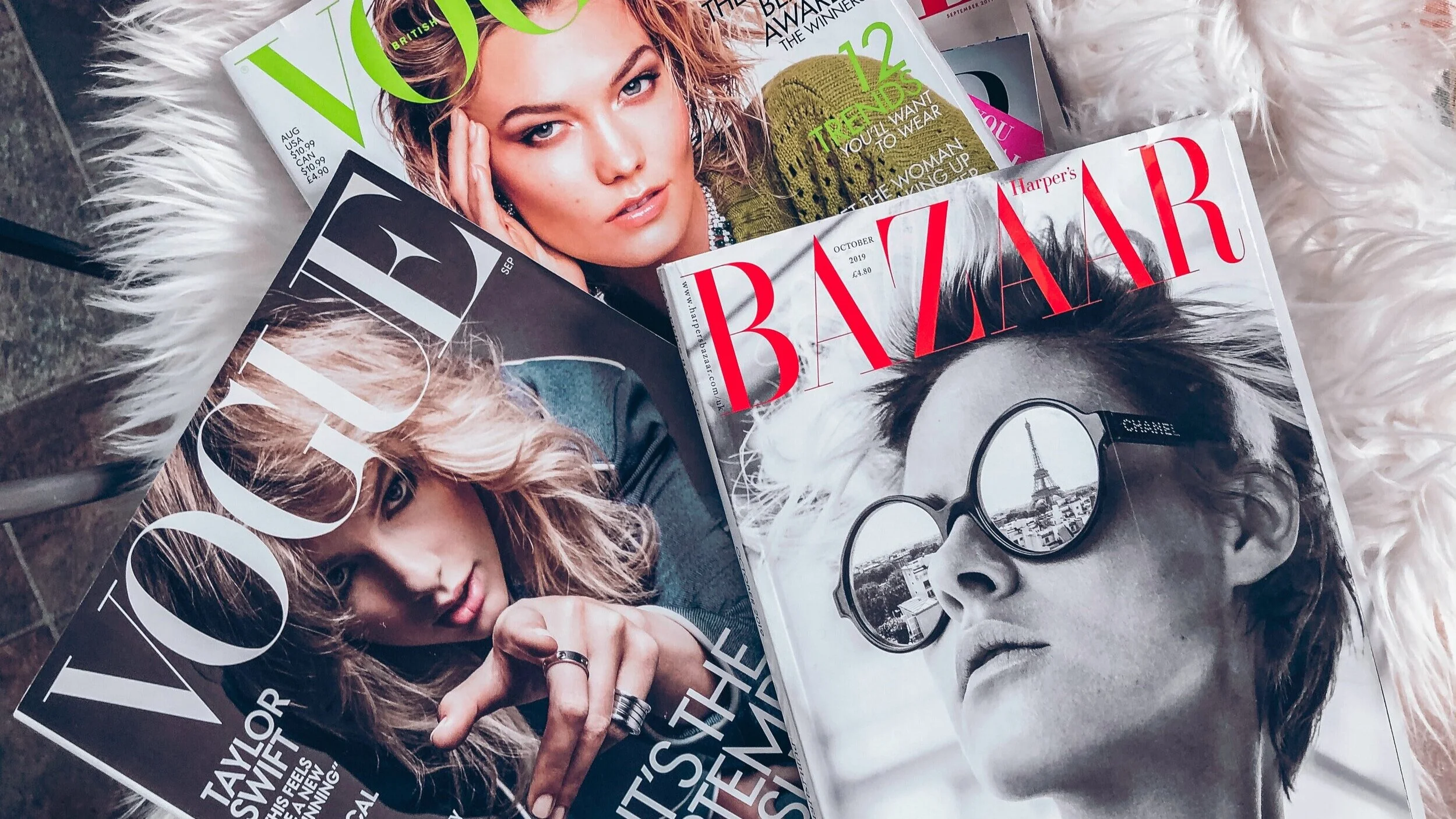
By completing a competitive analysis I have been able to understand the overall tone publication apps have as well as what approach should be taken during this redesign. To compare Vogue against their direct competitors, I researched the top fashion magazines and ultimately chose the three magazines consistently towards the top of the lists: ELLE, Harper’s BAZAAR, and InStyle. All three magazines produce content discussing beauty, high fashion, and women's lifestyle topics.
In this competitive analysis, I looked at the magazine's subscription price points, user reviews, and current state of the applications. Vogue offers a year of print and digital access for $12 compared to ELLE and Harper’s BAZAAR who offer a yearly subscription for $10. Instyle offers the most expensive yearly subscription price at $19.50. To be frank, ELLE, Harper’s BAZAAR, InStyle, and Vogue Magazine have all developed the same type of digital reader application. The apps have a single purpose which is to allow you to view their magazine in a pdf version that is not optimized to fit the screen. When looking at the user reviews for each of these applications, most of them were not made recently but dating back to as late as 2-8 years ago. As an aspiring UX designer, that is extremely disheartening to me as most of their users must have stopped using it because of their unsatisfactory usability functions. It's sad to see these publications can produce beautiful magazine layouts and website content but not be able to translate their design to mobile. Reviewing these applications reminded me of why I originally started this project.
In conjunction with my direct competitor analysis, I also conducted an indirect competitor analysis where I chose publications in three different industries: Rolling Stone, National Geographic, and The New York Times. These three publications were chosen because they disseminated text-heavy articles, high-resolution photographs, and dedicated consumer bases. I conducted this analysis similar to the direct competitors, as I looked at subscription price points, user reviews, and the current state of the applications. Rolling Stone offers a yearly subscription for print and digital access at $59.88, compared to National Geographic who offers a yearly subscription for $19. The New York Times has the most expensive yearly subscription model where basic digital access is $129.99 and all access is $299.88.
Rolling Stone prides itself on giving consumers access to exclusive first-hand looks behind the scenes, curated content, and their archive of coverage spanning six decades. Based on their user reviews, this application has been recently updated with great new features. Their subscribers love how their navigation is smooth and intuitive as it bridges the experience from the magazine to mobile seamlessly. The one downfall for the Rolling Stone app is it is marketed for subscribers only as non-subscribers can only read free articles on the desktop site.
National Geographic has also been recently updated but unlike Rolling Stone, their subscribers are not loving it. Users have been leaving reviews that the app is not visually appealing and the update is frustrating as the interactive content never seems to work. As I was scrolling through the application, I was able to see where the reviews were coming from as the videos did not play. Two things that I think the National Geographic app does well are interactive magazine covers and adding dark mode compatibility. I think these are great features that should be incorporated into the newly designed Vogue app.
With the reputation that The New York Times upholds, I had high hopes for their content transition from desktop to mobile. Their mobile design was a bit overwhelming to me as there were several ads after suggested articles and no spot colors added. Out of all of the apps I have browsed through for this analysis, The New York Times has the most extensive and well-detailed navigation bar. Based on the user reviews, subscribers are not fond of their interface design and how they can navigate through the app. Many of the negative reviews left were related to too many ads, however, there were some related to not being able to easily access basic functions such as the search button.
Based off of my competitive analysis here are my key takeaways:
Typography is important Mobile font size is not the same as desktop, the font should be easily legible with just the right size leading
Give the user the ability to scale text size
Be consistent across the platform - work off the style guide
Don’t let the text take up the entire screen, white space allows the content to breathe
Mobile allows for interactivity
Include the introduction of moving cover images and the addition of videos to articles
Navigation should be kept simple and mirror the desktop
Keep important elements within reach
Don’t hide items - make sure users are able to find key features such as search
Make sure images are properly optimized so that they are not awkwardly cropped
To allow readers to view content throughout the entire day, dark mode compatibility is imperative
Create the ability to personalize content
Stay consistent throughout page layouts
To view my full competitive analysis report, click here.