Vogue: The Beginning of Production
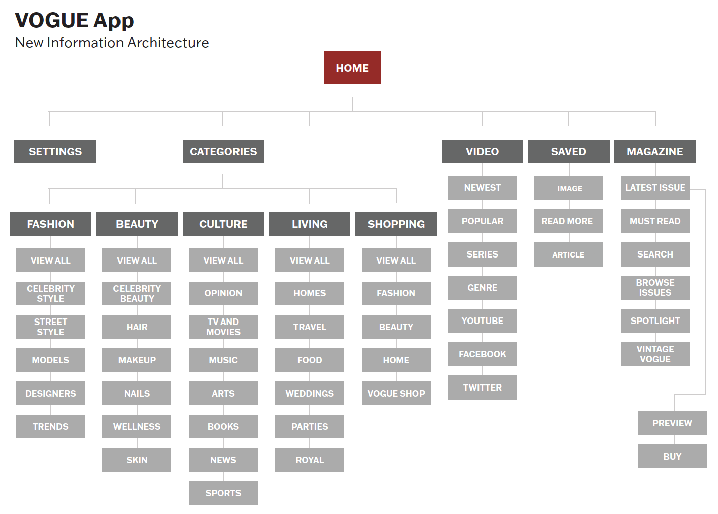
This week was the beginning of phase II: production where I will actively be developing Vogue’s redesigned app. I began phase II by establishing information architecture (IA), otherwise known as the layout of screen names to showcase how a user will be able to navigate throughout the app. UX Architect and writer, Nick Babich explains that information architecture is what connects users with the content and the context. It is important that I start my production phase by establishing an information architecture as it will act as a guidebook for my future weekly artifacts.
To create a new IA for Vogue, I began by looking and annotating the current IA on each of the apps (VogueWorld and Vogue Magazine) and their website. I wanted the navigation of the redesigned app to be similar to the current versions as it would promote a seamless experience and transition from magazine to mobile. To create this experience I jotted down navigation features that were a “must-have” from each platform. From the Vogueworld app, it became apparent to me that the video, latest, and saved tabs needed to be included in the redesign whether they were main or sub-navigation tabs. Vogueworld has good navigation established for the purpose of the app however I find that there is no substance within each tab. For one, the latest articles are not updated as frequently as they should be and the video tab is not even functional. Lack of substance was also an issue I had with the Vogue Magazine app as there are only three main navigation features: issues, downloads, and menu. For this app the only feature that I listed as a “must-have” navigation feature was the magazine. To me, the other features are arbitrary as they are overlapping tabs that can be easily simplified and combined into one.
As I began to seek out “must-have” features to include from the Vogue website, I became extremely overwhelmed. Vogue’s website has an extensive list of navigation tabs that I believe ultimately do not make sense for the overall site. I declared their main category pages (i.e. fashion, beauty, culture, living, and shopping) as their “must-have” features. Going through the website’s navigation pages made me realize the amount of detail that is lacking from each of the applications. For example, the magazine tab on the website is extremely immersive and gives you the option to not only read the latest issue but their archives and vintage vogue section. Reviewing the magazine tab set me up to develop wireframes that created that same experience.
After establishing the “must-have” features for my navigation, I developed my information architecture. The newly designed information architecture highlights all of the great parts of each application while still upholding all of the website’s substance. The development of my IA allowed me to design my wireframes. Wireframes are otherwise known as the blueprints for an application that are developed once the information architecture layout has been established. Creating both my information architecture and wireframes during the same week of production has allowed me to go back and forth between each artifact and tweak design elements to benefit the interface. The creation of wireframes is crucial to the following production stages as it will show the true functionality of the redesigned app without having the distraction of content and colors. The goal of this stage is to create the overall flow of the final application while addressing the user’s current struggles. As Vogue is known for its illustrious content and breathtaking high-quality imagery, it was imperative that my wireframes highlighted all of that.
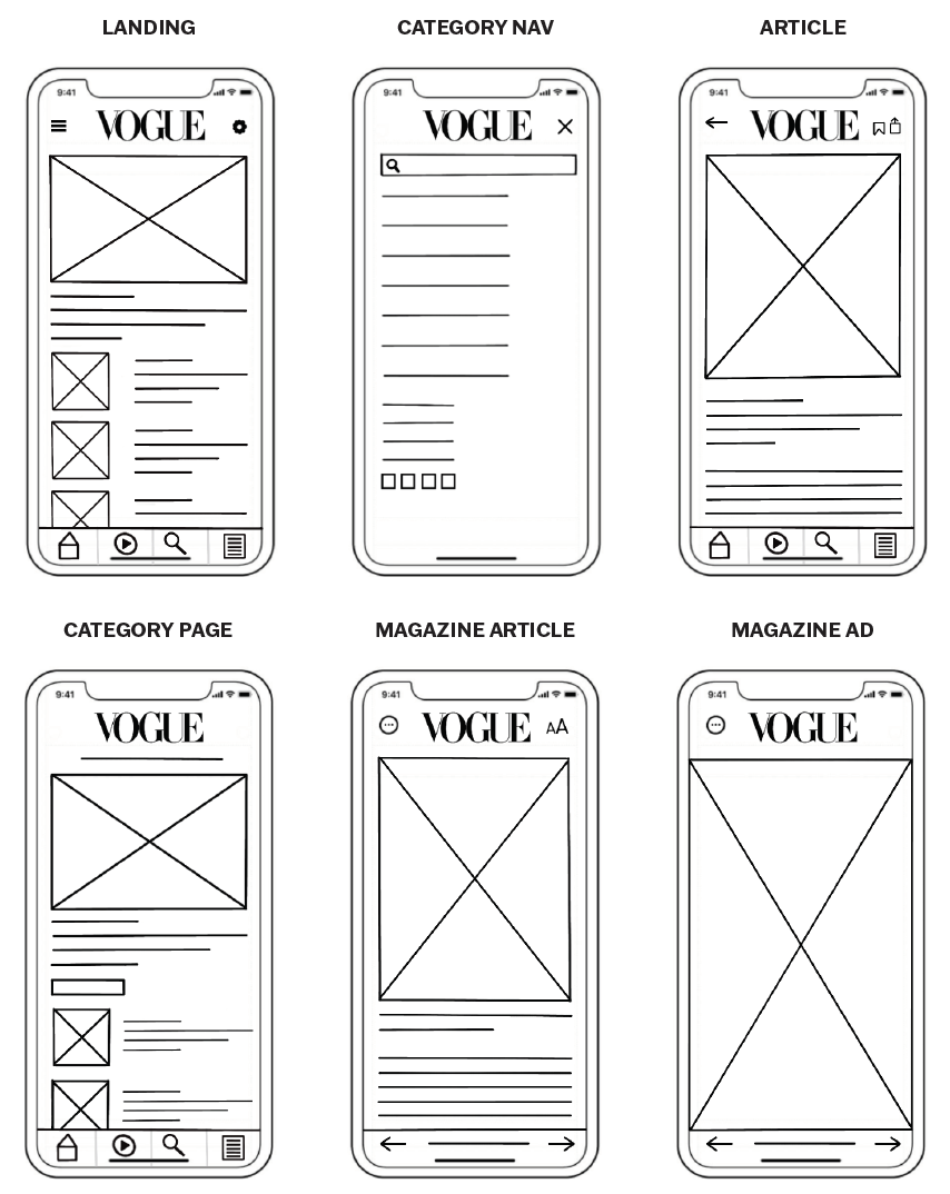
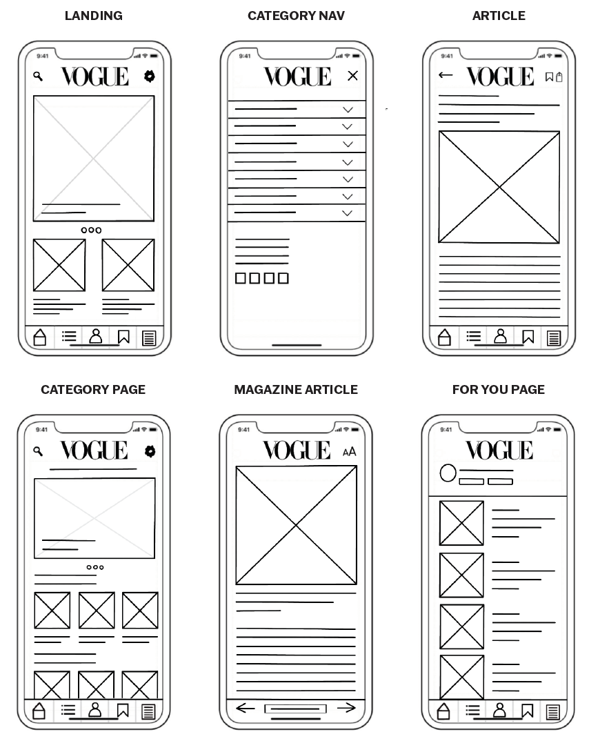
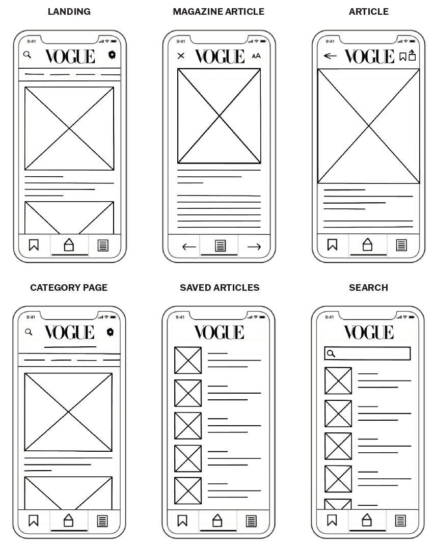
I started creating my wireframes by establishing three different navigation bars that encompassed all my “must-have” features from my information architecture. From there I was able to design around the navigation adding key content already established on Vogue’s website. I designed three different wireframes to make sure I did not settle on the first idea that I had put on paper. Three different wireframes allowed me to explore all possible design elements that can solve the issues at hand. When I was creating these wireframes, I kept referring back to my personas to remind myself that I am not designing for myself. In UX design it is important to utilize your created personas throughout the entire production process to keep your user’s needs in mind at all times.
Wireframe 1
Wireframe 2
Wireframe 3
Each wireframe above incorporates the same navigation components however they are placed in different areas. While they may look like just straight lines and boxes right now, each element is important to the design to create a seamless transition. To make it easier on myself when I go to create my prototypes next week, I decided to annotate elements on each screen. The annotations will allow me to add the correct color and type studies from Vogue's established style guide to bring my prototype to life. Even though my wireframes illustrate clearly where each element belongs when I begin prototyping I may realize that some things just do not work. For example, when I add color and type studies to wireframe 1, I may realize that the hamburger menu does not flow well with the design and it may work better with the layout of either wireframe 2 or 3. As of right now, I believe my wireframes are detailed enough to further proceed in my production process.
To view my annotated wireframes, click here.


