Vogue: User Research
As of the work I have completed this week, phase I: research has concluded. Up until this point, I have researched topics that will aid me in designing for content-heavy applications such as best UX practices, where Vogue stands as a brand, and how it compares to its direct and indirect competitors. To close out phase I, I conducted user research including interviews, empathy mapping, and the development of personas. In my opinion, conducting user research has been the most important part of my redesign process because it has allowed me to gain a deeper understanding of a user’s true accomplishments and frustrations when using the application.
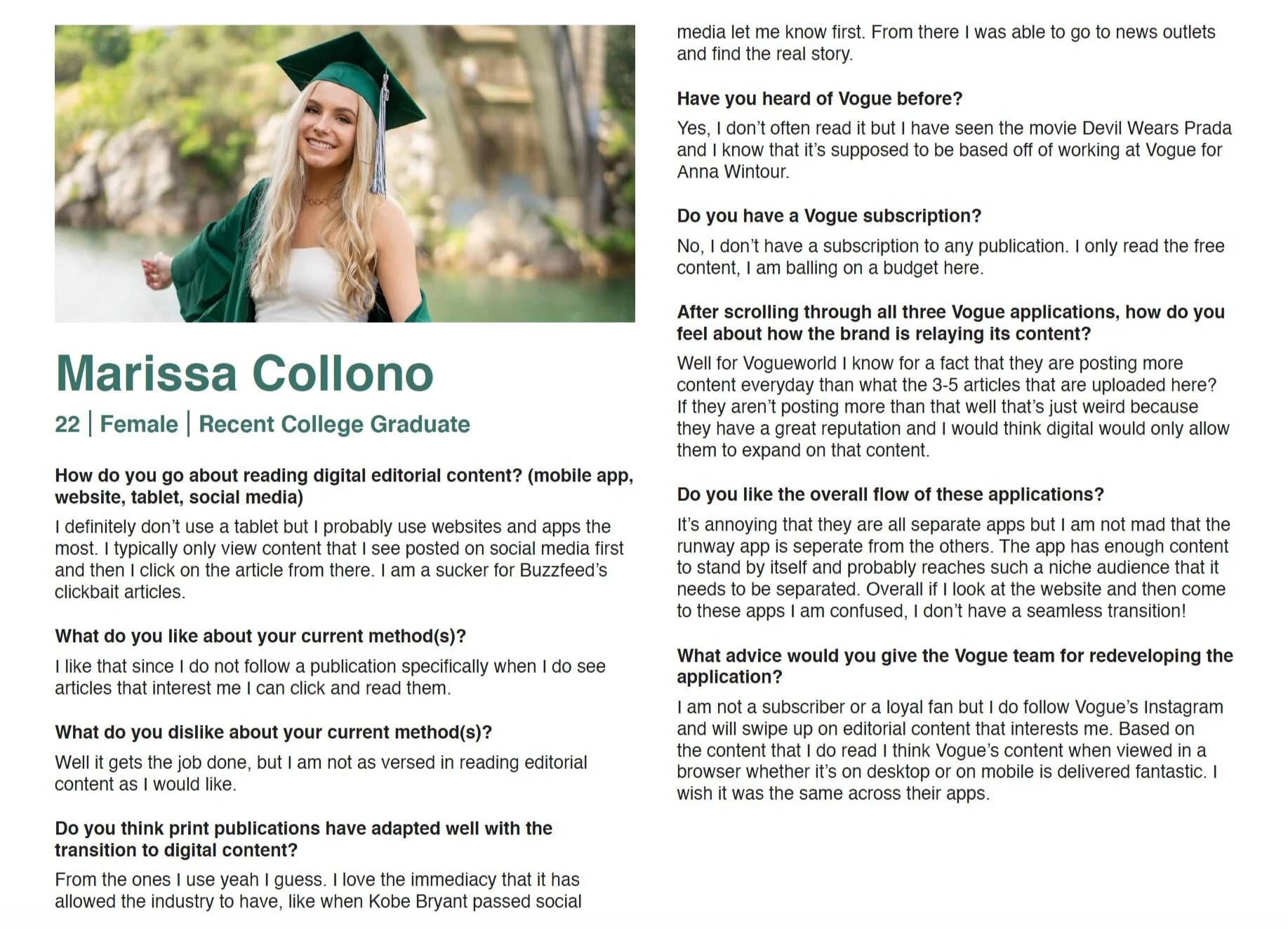
I began my user research by revisiting the competitive analysis that I had created last week. Based on the key takeaways that I listed, I drafted questions to ask my participants in a usability interview. I split my interview questions into two categories: general editorial questions and Vogue related questions. The goal of the general editorial questions was to get an idea of what their digital consumption methods are and what they like and dislike about them. My three participants Elisa, Marissa, and Gianna each had different consumption habitats ranging from using only dedicated news apps, reading stories promoted on social media, and being a subscribed user to certain publications. The difference in their consumption habits allowed me to gain insight into the reasoning behind why a user chooses to consume editorial the way they do. For example, Marissa explained that right now she cannot afford to be a subscriber to a vast amount of publications as she is a recent college graduate and does not have a steady income. I concluded the general editorial questions by asking how the participants felt overall about the print industry adapting to digital content. All three of my participants agreed that brands in general have adapted well and can see them continually getting better. It was reiterated in all three of my interviews that digital content is seen to be more engaging as it allows more room for interactivity.
Before asking the questions related to Vogue, I let each participant browse through all three applications as well as the desktop site to be familiar with their content style. I purposely did not explain the meaning of the three Vogue applications beforehand to gauge how the users felt about the unbundled approach. I asked each participant to tell me about their experience scrolling through the applications and how they felt about the way the content was being displayed. To be blunt, none of the participants were in love with the way the applications were set up. As they scrolled through I observed their actions and took notes of their key behaviors and frustrations to later form into an empathy map. At the end of each interview, I explained the purpose of my research and asked them if they had any advice to give to Vogue for further improvements. The answers I received were unanimous across the board, they believed in the reputation that Vogue holds in the industry, their applications do not relate. Participant 3 Gianna, mentioned that they should not go with the basics because they know it works. She encourages Vogue to be different and think outside-the-box.
Participant’s User Interview
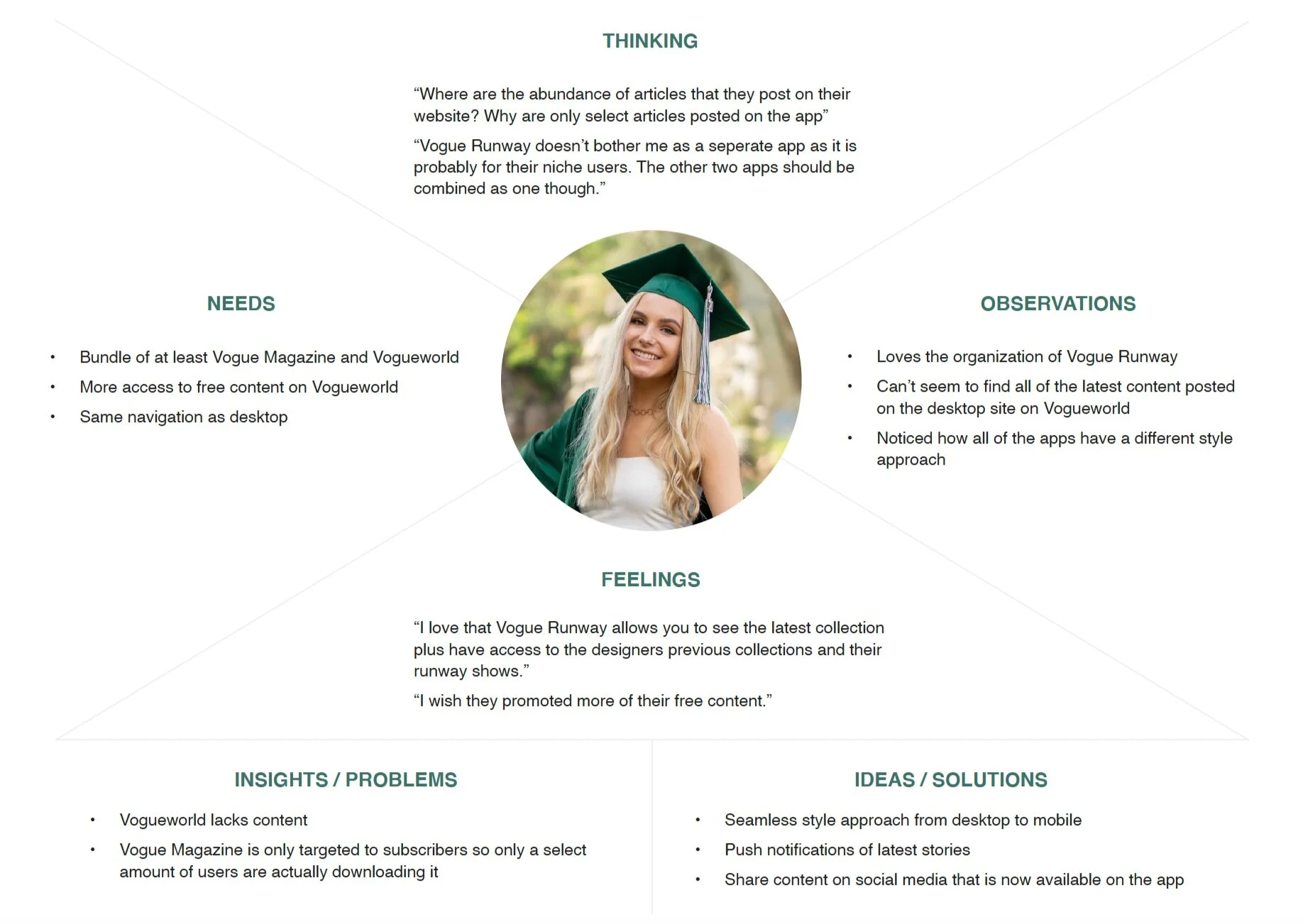
Based on the user interviews I had conducted, I created an empathy map for each participant. Empathy maps are a simple way to get into your user’s head, it allows you to empathize and understand what a user is thinking and feeling. The empathy maps created touched upon what each user was thinking, feeling, needing, and doing when scrolling through Vogue’s applications and desktop site. Each empathy map also gave insight into existing problems and possible solutions.
Participant’s Empathy Map
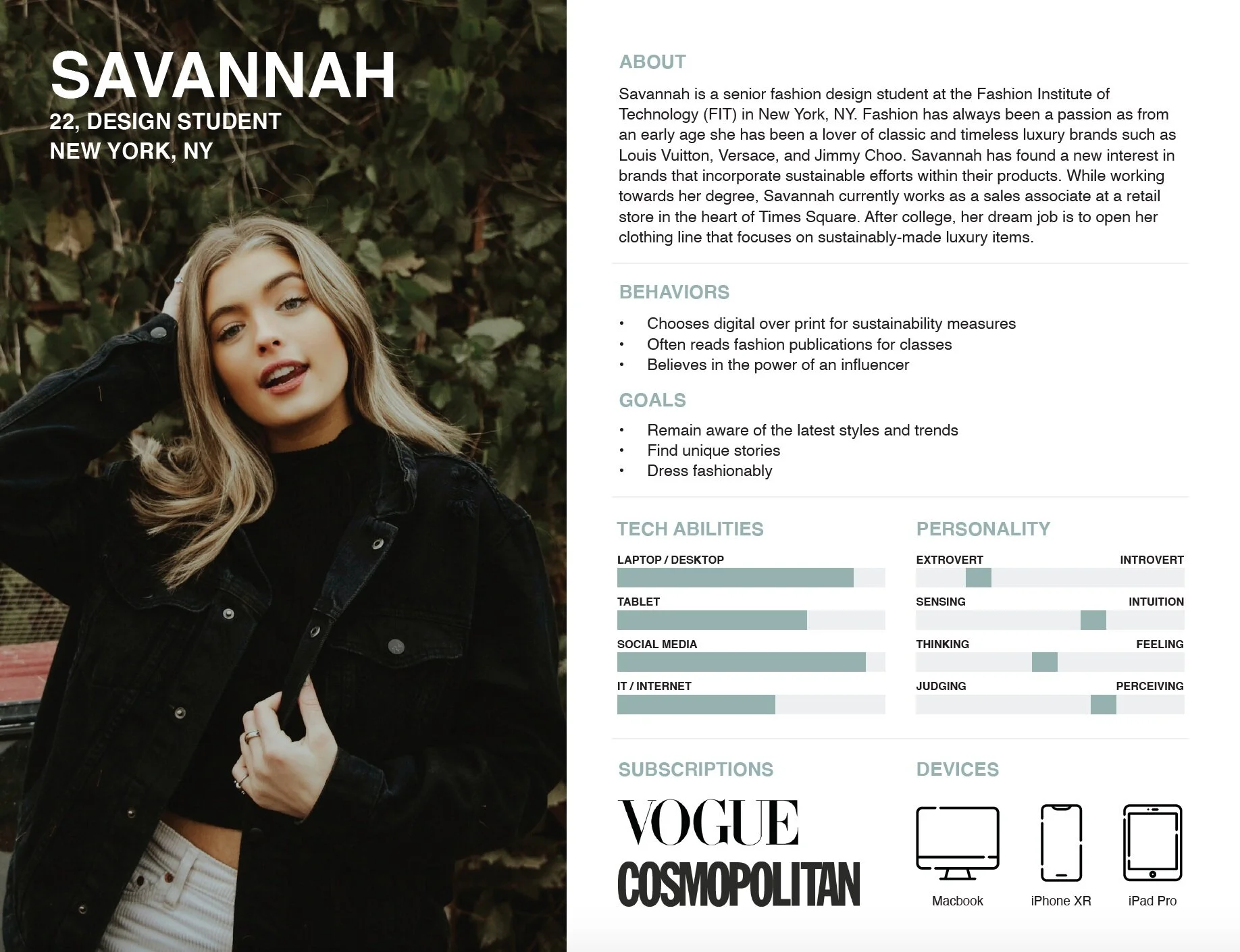
To create better relationships and understand a user's motivations I used the data collected in my user research to create five personas. Personas are archetypical users whose goals and characteristics represent the needs of a larger group of users. The development of personas will prevent me from designing for myself and rather design for people who will be frequently using the application.
By using Vogue’s already established target market, I was able to develop personas in their audience and highlight their key traits and overall needs when using the application. The five personas include:
Savannah, a senior design student enrolled in FIT
Evie, an associate buyer for a high-class department store
Morgan, a fashion social media manager who is also interested in becoming an influencer
Camilla, an account executive who’s day to day tasks include building and fostering media relationships
Layla, a fashion editor who runs her own style blog
These five personas include key characteristics that an audience at a much larger scale can relate to. Each of their personas includes a short biography, their behaviors and goals, personality traits, technology abilities, the subscription services they are currently subscribed to, and what devices they own. When I developed these personas I wanted each of their personalities to represent an accurate representation of a potential user.
To view my full user research click here.


